3ds Max Tutorial 002: Give us a Hand
Introduction
This tutorial describes the making of a material of my left hand, as an introductory overview of the way Discreet 3D Studio Max approaches materials. This tutorial will demonstrate the way different maps may be combined together to make convincing materials, but will not give a detailed, step by step guide for how this is done. 3ds Max comes with a very good online reference, found under Help > User Reference…, and the reader is encouraged to look up certain help topics in the user reference. These topics will be highlighted in bold, and can be searched for in the user reference with the “Search titles only” option checked. Most importantly, the user reference explains all the tools in Max button by button, so this is something that I will not be doing. Instead, I will refer the reader to the user reference.
This tutorial was created with reference to version 7 of 3ds Max, but it should apply to most other versions as well. As a note, it to me 45 minutes to create this hand material from scratch, using Adobe Photoshop and 3d Studio Max.
Know Your Tools
If you are new to materials in 3ds Max, then you have a bit of reading to do. First, go and look up “Material Editor, Materials, and Mapping” in the user reference. After that, follow the link to Designing Materials, which gives an outline of the workflow involved in making materials in Max. It probably goes into more depth then you need to start with, so just read it and don’t worry if you don’t understand everything. Next, look up Material Editor and familiarise yourself with that window. At this point you can also look up Types of Materials to see what’s on offer, but for this tutorial we’ll only be looking at the Standard Material, so make sure you read up on that. At the bottom of that entry, there are further links to sub-entries, which are useful to read. The most important is the Maps Rollout (Standard Material), and at the bottom of that entry are more links again, this time to the different types of maps. I highly recommend you reading up on all of them, but the ones that are dealt with in this tutorial are Diffuse Colour Mapping, Specular Level Mapping, Glossiness Mapping, and Bump Mapping.
Once you’ve read all that, you’ll know more than what you need to know to start making materials in Max. In fact, it may be a good idea for you to try out some of the tools you’ve just read about. But if you keep reading, I’ll tell you about how I make a material of my left hand.
Learning to Look
The secret to making realistic materials is learning to look at things closely. If you’re not interested in realistic materials, you’ll still need to understand clearly what you want to make. I chose to make a material of my left hand for this tutorial because most people have at least one hand on hand to look at, and I will ask you to look very closely at yours right now.
Looking at the palm of my hand, the first things I notice are the creases in the skin. Next I notice that the colour of my palm is generally a yellowish pink, although the tone is not uniform. I can also see faint blue-green veins beneath the skin. The creases in the skin are generally a darker tone than the surrounding flesh. Next, I see that the surface of the skin is somewhat glossy, and as I move my hand around, I can see the specular reflection of the light highlighting the texture and creases.
Having looked at my hand closely, I can now translate what I see into the different maps I need to make. I know that the diffuse colour component is the non-uniform yellowish pink with the blue-green veins and slightly darker creases. I know that the specular level and glossiness components describe how the specular reflection of the glossy parts of my palm highlights the textures. Lastly, I know that the bump component describes the slight grooves formed by the creases. Knowing these things, I drew some maps in Photoshop.
First, I used the brush tool to draw the diffuse map without the creases of the palm. Then I drew the bump map, again using the brush tool but with a much small brush size. I then adapted the bump map to create the specular map, which is basically the same thing but with lower contrast. I then used this map again and adapted it to make the creases in the diffuse map. Then I adapted the bump map again for the glossiness map, adding noise using the Add Noise filter in Photoshop. Actually, it wasn’t quite as straightforward as that. Originally I didn’t have the creases on the diffuse map and the noise on the glossiness map, but I added them after I tried them out in 3ds Max and found them unsatisfactory. Making materials always involve an element of trial and error, and the ability to know how to fix something that doesn’t look right is a matter of understanding how the tools work.
Show Me Some Skin
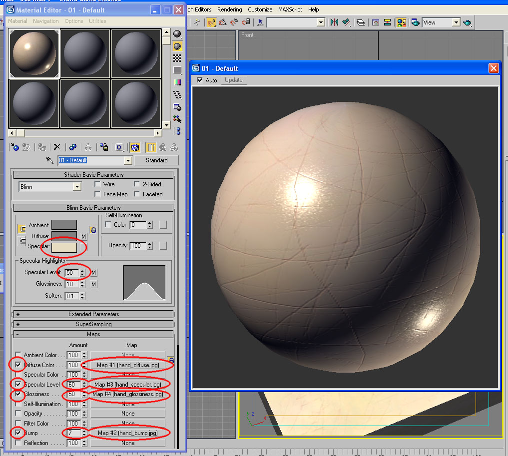
Once the maps are made, it is simply a matter of putting them in the right slots in the material editor and adjusting the amounts of each map. Below is a screenshot of the material editor after I’ve set everything up, with the changes from the default settings highlighted and a magnification of the sample slot. Once again, working out the amounts for each map is a matter of trial and error, trying out different values to see what works and what doesn’t.

The following are two views of the material applied to a box. The first view has the camera angled to catch the specular reflection from the light; the second view is angled away from the specular reflection.

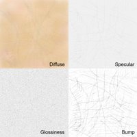
Below are each of the four components rendered separately by turning off the others. You’ll notice that the specular level, glossiness, and bump components don’t do very much on their own, and need to be combined to have much affect. It is often better to build up the texture of a material using many subtle effects than to try to use only one map.

Debrief
That ends our brief overview of the Standard Material. As you probably gathered by now, materials in 3ds Max can simulate the appearance of objects in the real world, but otherwise they have very little in common. In reality, all the diffuse, specular, and glossiness components of an object are in fact the result of electromagnetic radiation interacting with a collection of molecules at the atomic level, reflecting off those molecules in varying ways. In Max, that interaction is approximated by calculations, components of which may be turned on and off. Therefore, it is important to not expect materials in Max to behave the way one might expect them to behave in the real world, but rather understand that it is a whole other system with different rules.
As I said earlier, the secret to making realistic materials is learning to look at things closely. If I ask you to describe to be a piece of A4, laser quality paper, and you tell me it’s white, then you’re not looking closely enough. Looking at a piece of A4 paper right now, I can tell you that it’s not entirely uniform white, that it has a certain texture formed by the wood fibres that make up the paper, and that it has a certain specular component. In brief, I would say that it is very faintly splotchy. Do not underestimate such subtleties; the human mind is very good at feeling uncomfortable when something isn’t quite right, even if it can’t determine exactly what’s wrong. People often criticise poor computer renders as being “flat”, “dead”, or “plastic”. This is precisely because the subtleties have been overlooked.
Once you have come to grips with the standard material, you may like to have a look at the Raytrace Material, the Architectural Material, and the Ink ‘n Paint Material. Raytrace and Architectural materials allow more effects, most notably reflections, but are also more computationally intensive at render time. It is generally advisable to use the standard material wherever possible, and only use the more advanced materials when you want specific effects that are not possible with the standard material. The Ink ‘n Paint Material generates cartoon-like effects.
I hope this tutorial has been helpful, and I wish you luck with your materials.
Simon Chun Kwan Chui
21/6/2006
This tutorial describes the making of a material of my left hand, as an introductory overview of the way Discreet 3D Studio Max approaches materials. This tutorial will demonstrate the way different maps may be combined together to make convincing materials, but will not give a detailed, step by step guide for how this is done. 3ds Max comes with a very good online reference, found under Help > User Reference…, and the reader is encouraged to look up certain help topics in the user reference. These topics will be highlighted in bold, and can be searched for in the user reference with the “Search titles only” option checked. Most importantly, the user reference explains all the tools in Max button by button, so this is something that I will not be doing. Instead, I will refer the reader to the user reference.
This tutorial was created with reference to version 7 of 3ds Max, but it should apply to most other versions as well. As a note, it to me 45 minutes to create this hand material from scratch, using Adobe Photoshop and 3d Studio Max.
Know Your Tools
If you are new to materials in 3ds Max, then you have a bit of reading to do. First, go and look up “Material Editor, Materials, and Mapping” in the user reference. After that, follow the link to Designing Materials, which gives an outline of the workflow involved in making materials in Max. It probably goes into more depth then you need to start with, so just read it and don’t worry if you don’t understand everything. Next, look up Material Editor and familiarise yourself with that window. At this point you can also look up Types of Materials to see what’s on offer, but for this tutorial we’ll only be looking at the Standard Material, so make sure you read up on that. At the bottom of that entry, there are further links to sub-entries, which are useful to read. The most important is the Maps Rollout (Standard Material), and at the bottom of that entry are more links again, this time to the different types of maps. I highly recommend you reading up on all of them, but the ones that are dealt with in this tutorial are Diffuse Colour Mapping, Specular Level Mapping, Glossiness Mapping, and Bump Mapping.
Once you’ve read all that, you’ll know more than what you need to know to start making materials in Max. In fact, it may be a good idea for you to try out some of the tools you’ve just read about. But if you keep reading, I’ll tell you about how I make a material of my left hand.
Learning to Look
The secret to making realistic materials is learning to look at things closely. If you’re not interested in realistic materials, you’ll still need to understand clearly what you want to make. I chose to make a material of my left hand for this tutorial because most people have at least one hand on hand to look at, and I will ask you to look very closely at yours right now.
Looking at the palm of my hand, the first things I notice are the creases in the skin. Next I notice that the colour of my palm is generally a yellowish pink, although the tone is not uniform. I can also see faint blue-green veins beneath the skin. The creases in the skin are generally a darker tone than the surrounding flesh. Next, I see that the surface of the skin is somewhat glossy, and as I move my hand around, I can see the specular reflection of the light highlighting the texture and creases.
Having looked at my hand closely, I can now translate what I see into the different maps I need to make. I know that the diffuse colour component is the non-uniform yellowish pink with the blue-green veins and slightly darker creases. I know that the specular level and glossiness components describe how the specular reflection of the glossy parts of my palm highlights the textures. Lastly, I know that the bump component describes the slight grooves formed by the creases. Knowing these things, I drew some maps in Photoshop.
First, I used the brush tool to draw the diffuse map without the creases of the palm. Then I drew the bump map, again using the brush tool but with a much small brush size. I then adapted the bump map to create the specular map, which is basically the same thing but with lower contrast. I then used this map again and adapted it to make the creases in the diffuse map. Then I adapted the bump map again for the glossiness map, adding noise using the Add Noise filter in Photoshop. Actually, it wasn’t quite as straightforward as that. Originally I didn’t have the creases on the diffuse map and the noise on the glossiness map, but I added them after I tried them out in 3ds Max and found them unsatisfactory. Making materials always involve an element of trial and error, and the ability to know how to fix something that doesn’t look right is a matter of understanding how the tools work.

Show Me Some Skin
Once the maps are made, it is simply a matter of putting them in the right slots in the material editor and adjusting the amounts of each map. Below is a screenshot of the material editor after I’ve set everything up, with the changes from the default settings highlighted and a magnification of the sample slot. Once again, working out the amounts for each map is a matter of trial and error, trying out different values to see what works and what doesn’t.
The following are two views of the material applied to a box. The first view has the camera angled to catch the specular reflection from the light; the second view is angled away from the specular reflection.

Below are each of the four components rendered separately by turning off the others. You’ll notice that the specular level, glossiness, and bump components don’t do very much on their own, and need to be combined to have much affect. It is often better to build up the texture of a material using many subtle effects than to try to use only one map.

Debrief
That ends our brief overview of the Standard Material. As you probably gathered by now, materials in 3ds Max can simulate the appearance of objects in the real world, but otherwise they have very little in common. In reality, all the diffuse, specular, and glossiness components of an object are in fact the result of electromagnetic radiation interacting with a collection of molecules at the atomic level, reflecting off those molecules in varying ways. In Max, that interaction is approximated by calculations, components of which may be turned on and off. Therefore, it is important to not expect materials in Max to behave the way one might expect them to behave in the real world, but rather understand that it is a whole other system with different rules.
As I said earlier, the secret to making realistic materials is learning to look at things closely. If I ask you to describe to be a piece of A4, laser quality paper, and you tell me it’s white, then you’re not looking closely enough. Looking at a piece of A4 paper right now, I can tell you that it’s not entirely uniform white, that it has a certain texture formed by the wood fibres that make up the paper, and that it has a certain specular component. In brief, I would say that it is very faintly splotchy. Do not underestimate such subtleties; the human mind is very good at feeling uncomfortable when something isn’t quite right, even if it can’t determine exactly what’s wrong. People often criticise poor computer renders as being “flat”, “dead”, or “plastic”. This is precisely because the subtleties have been overlooked.
Once you have come to grips with the standard material, you may like to have a look at the Raytrace Material, the Architectural Material, and the Ink ‘n Paint Material. Raytrace and Architectural materials allow more effects, most notably reflections, but are also more computationally intensive at render time. It is generally advisable to use the standard material wherever possible, and only use the more advanced materials when you want specific effects that are not possible with the standard material. The Ink ‘n Paint Material generates cartoon-like effects.
I hope this tutorial has been helpful, and I wish you luck with your materials.
Simon Chun Kwan Chui
21/6/2006
posted by sckChui at 11:30 pm
![]()


0 Comments:
Post a Comment
<< Home